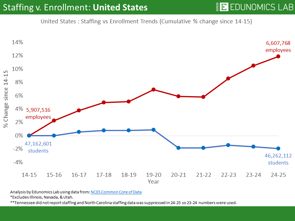
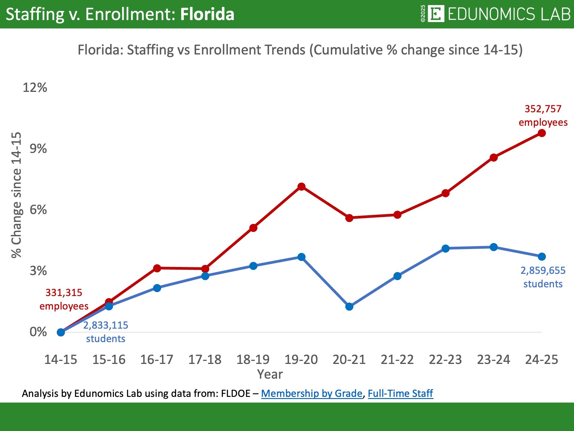
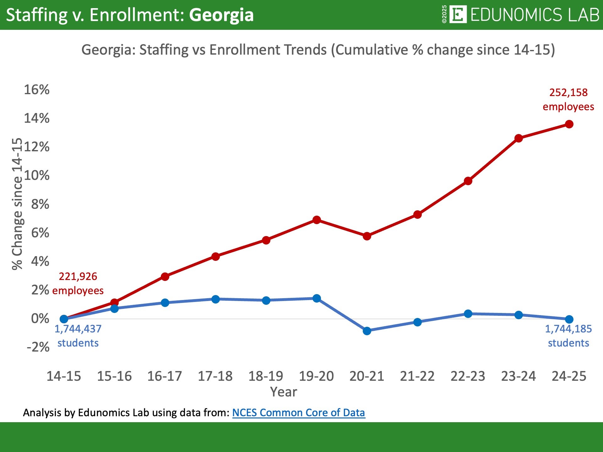
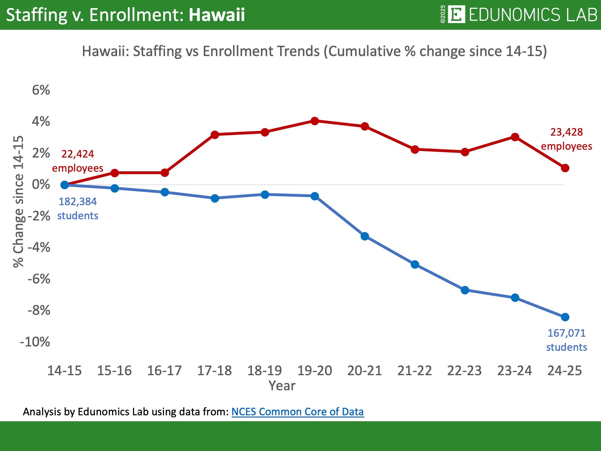
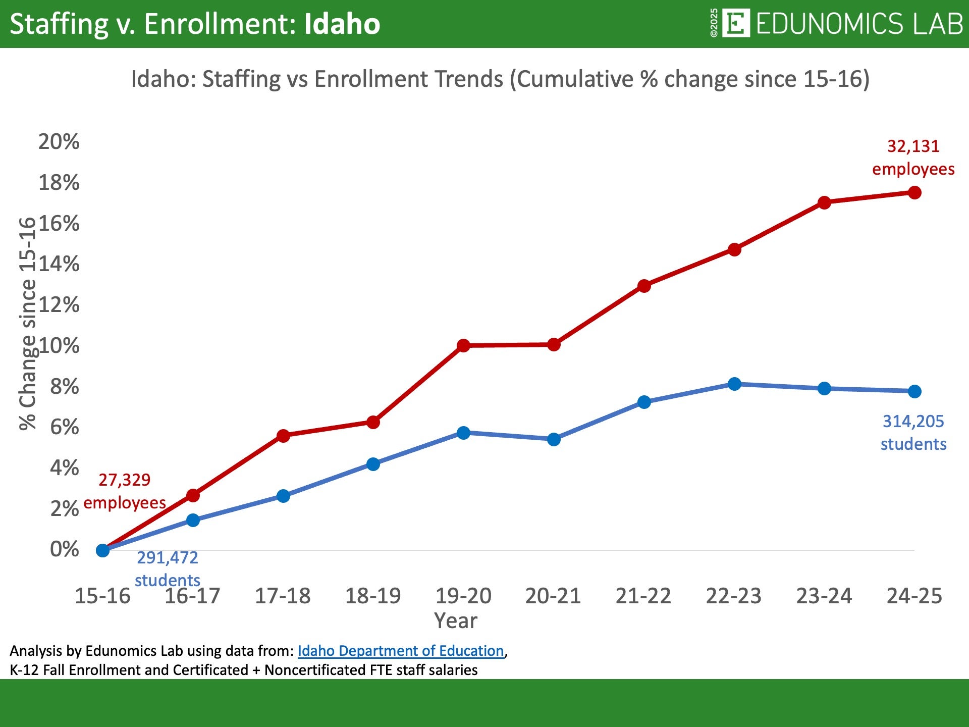
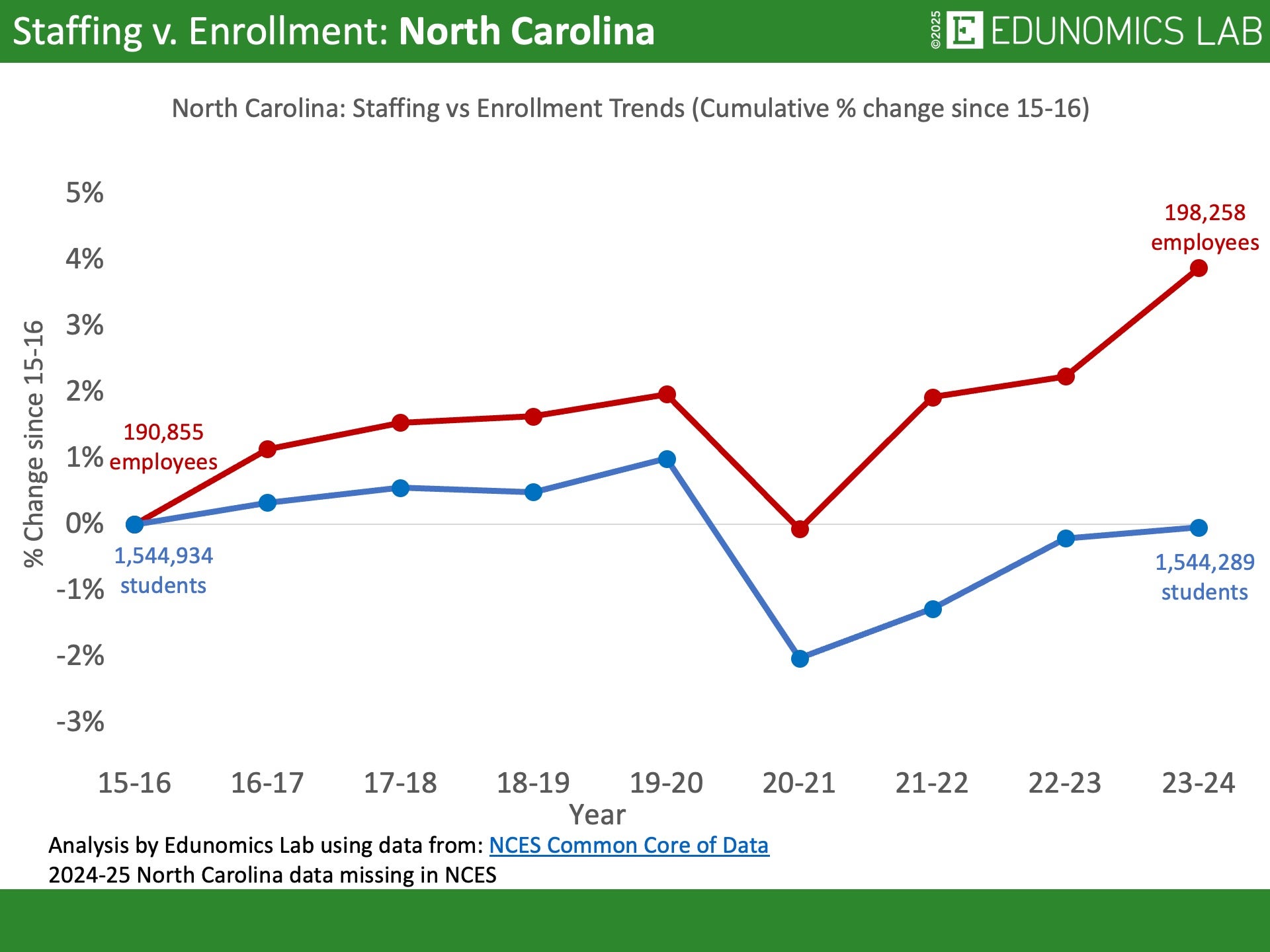
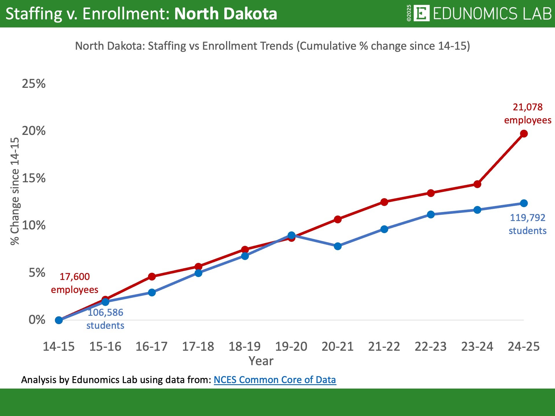
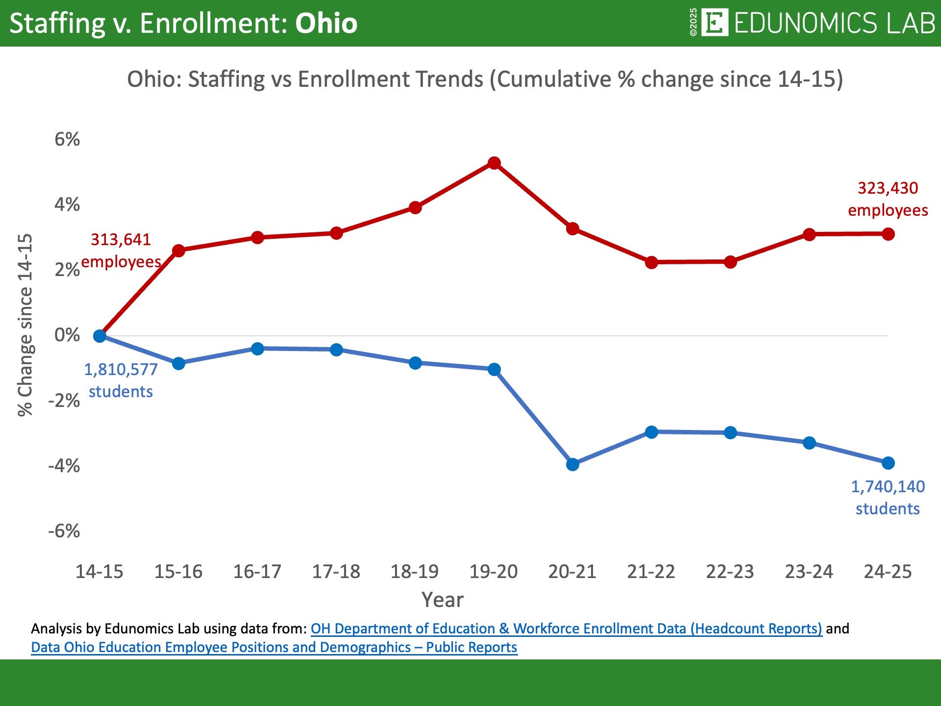
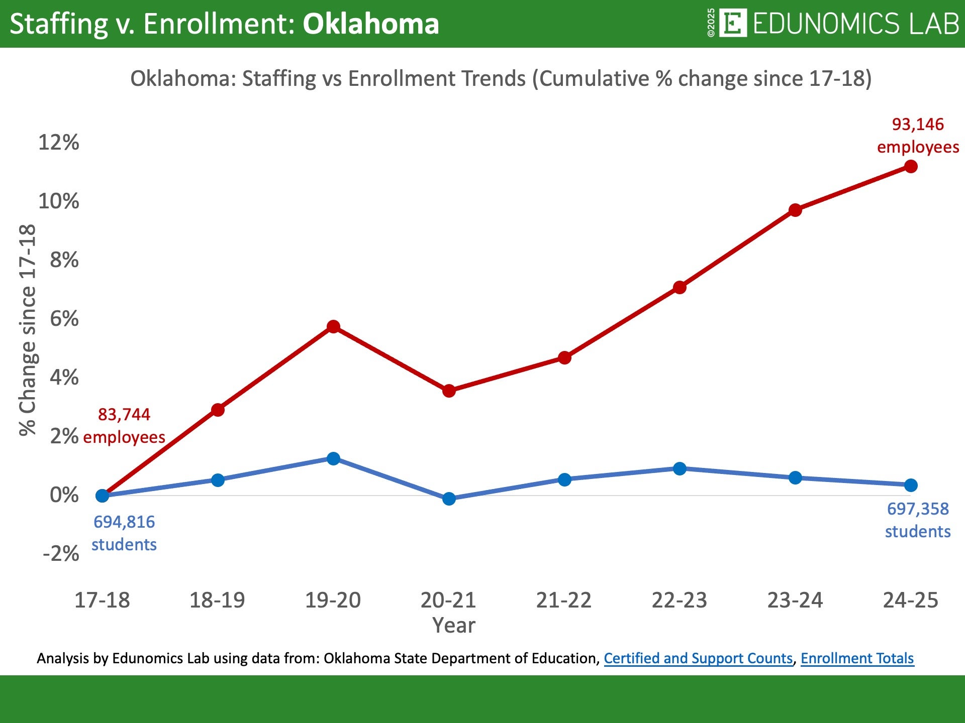
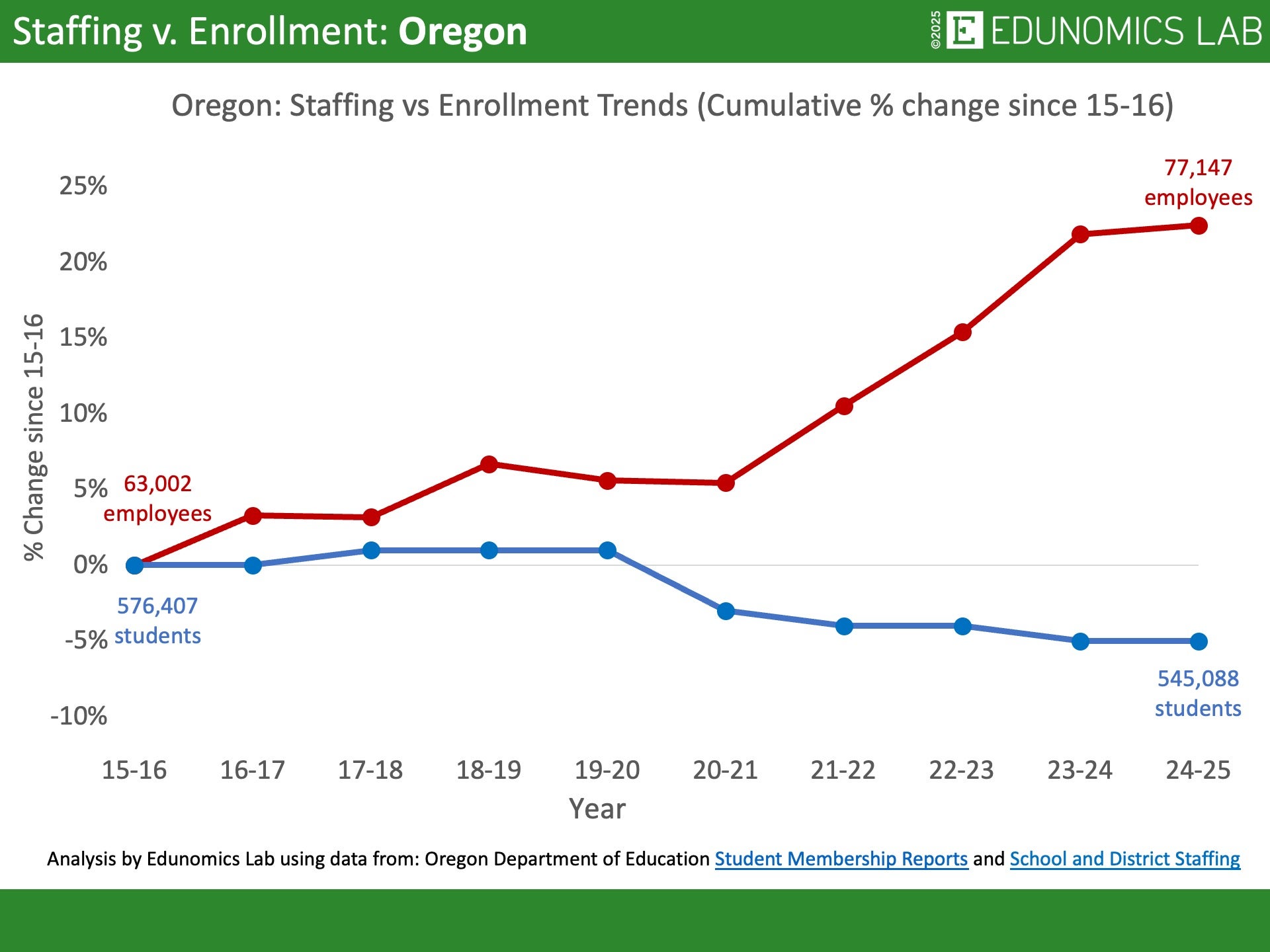
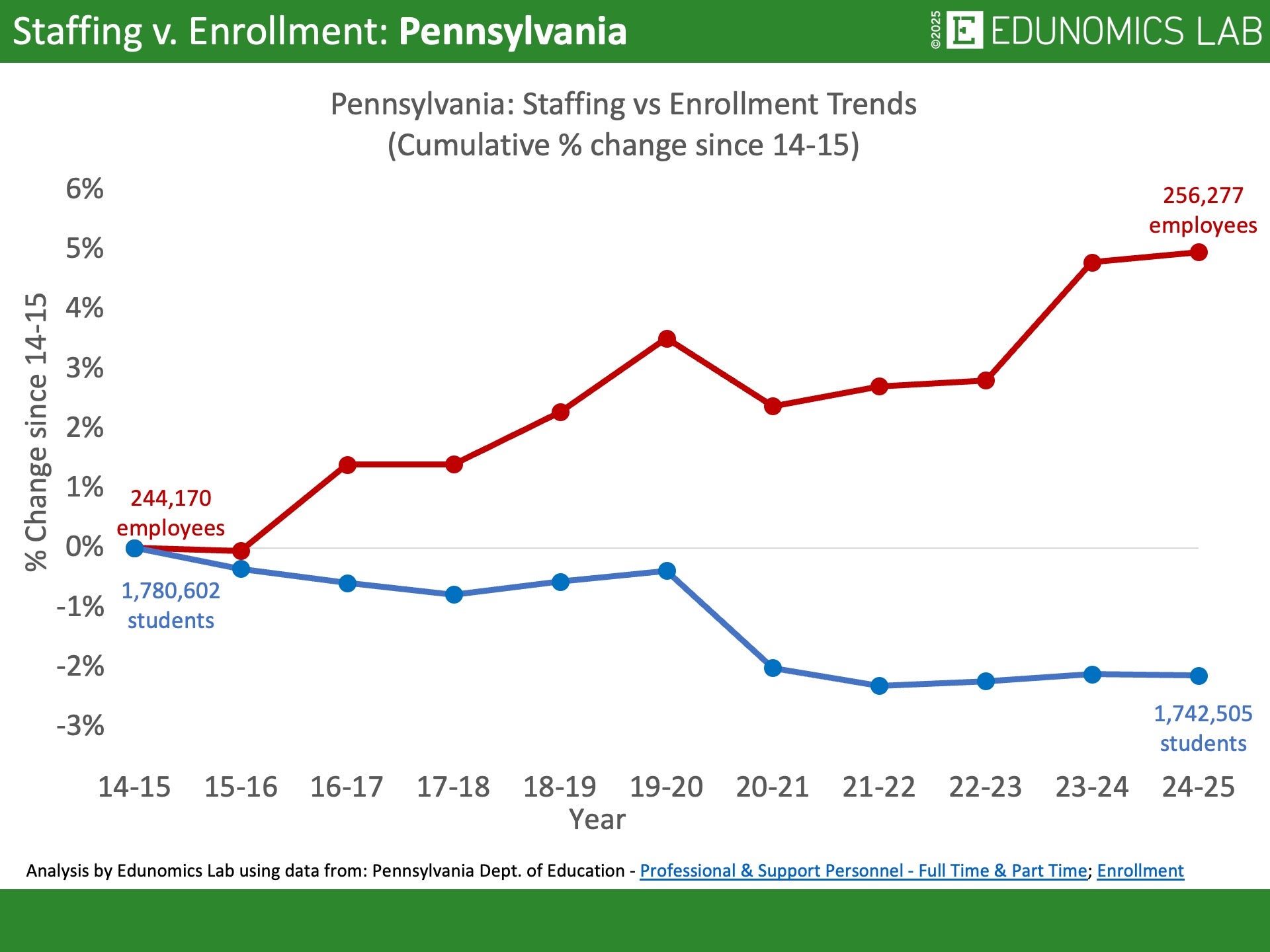
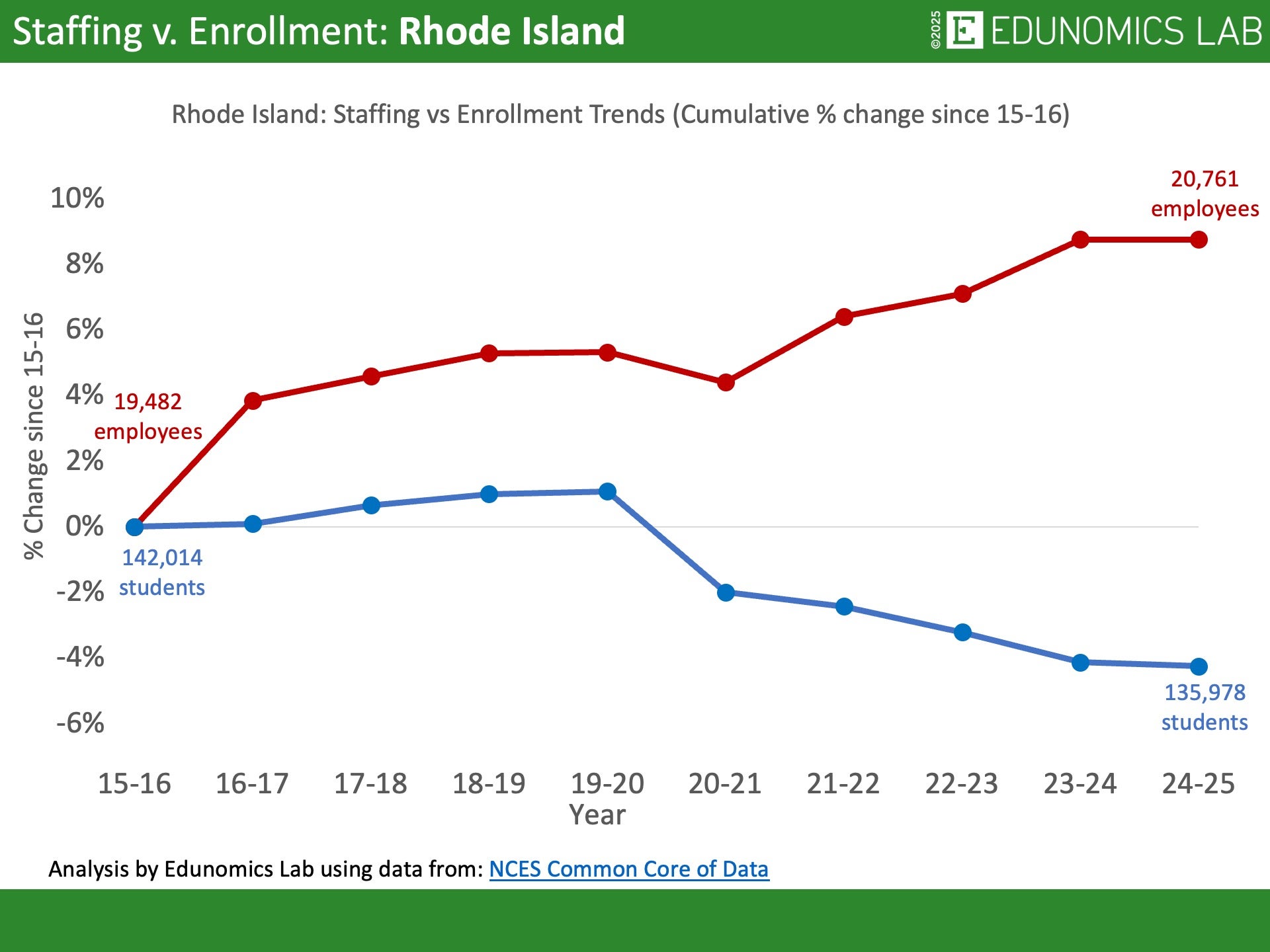
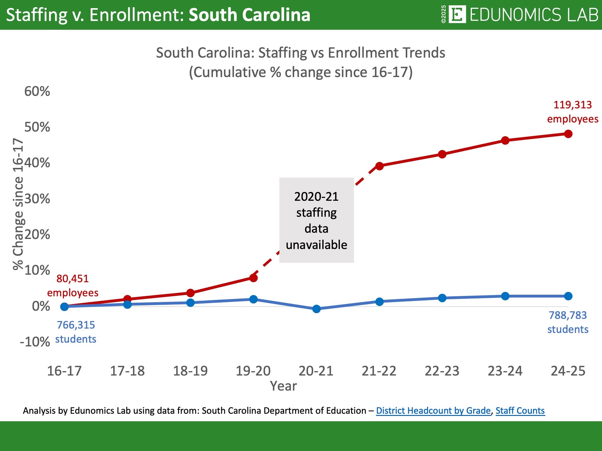
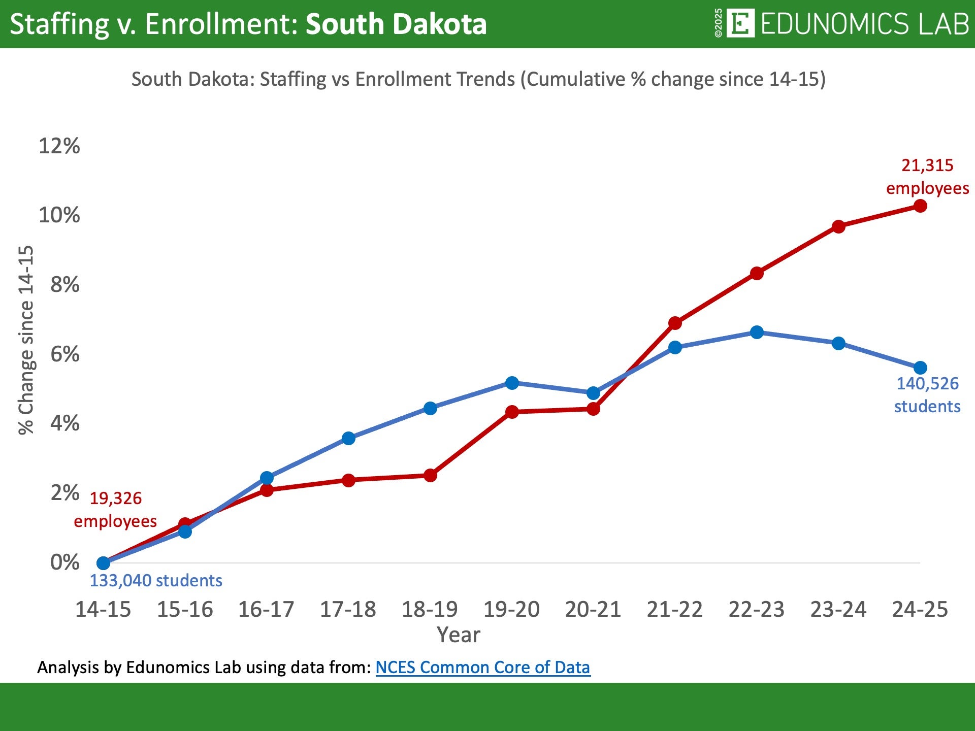
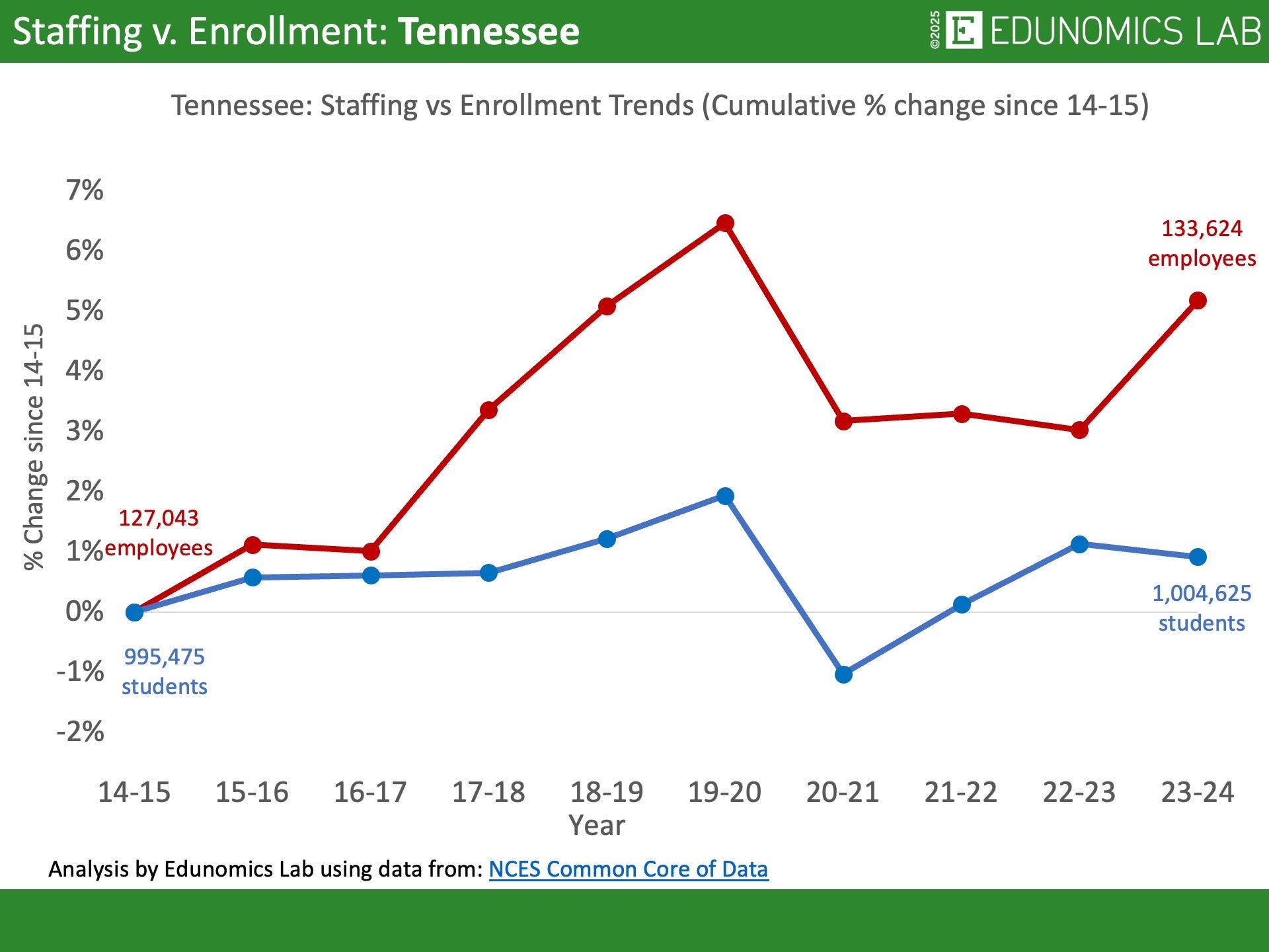
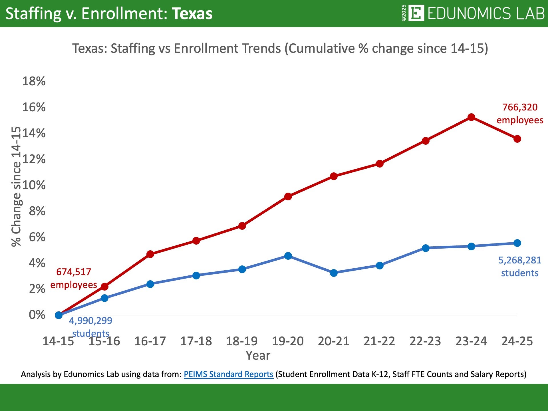
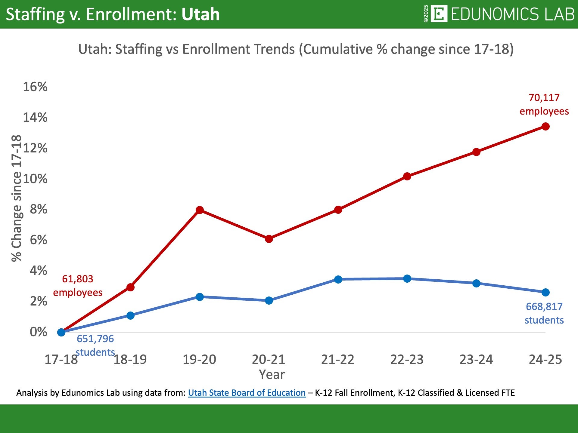
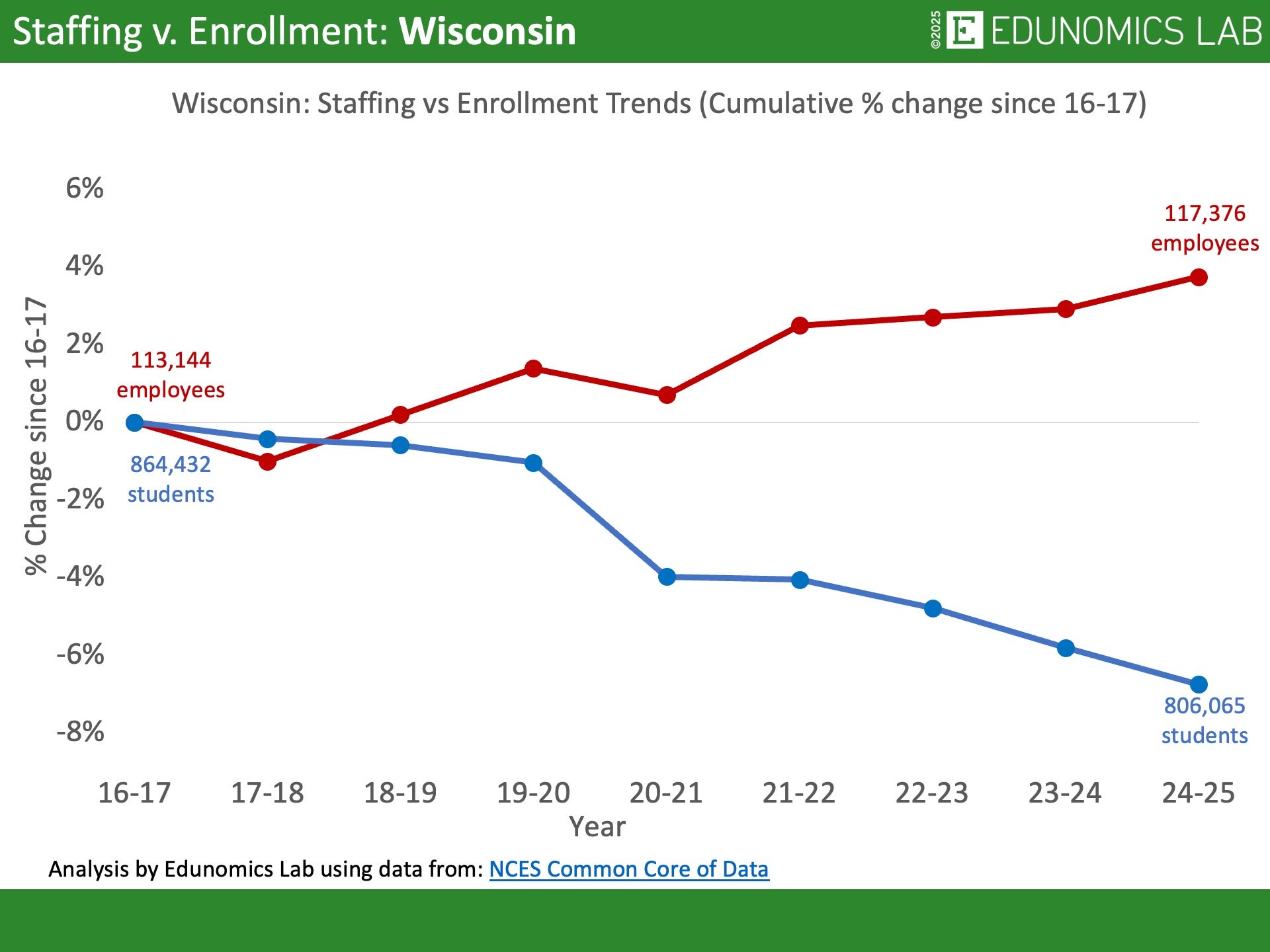
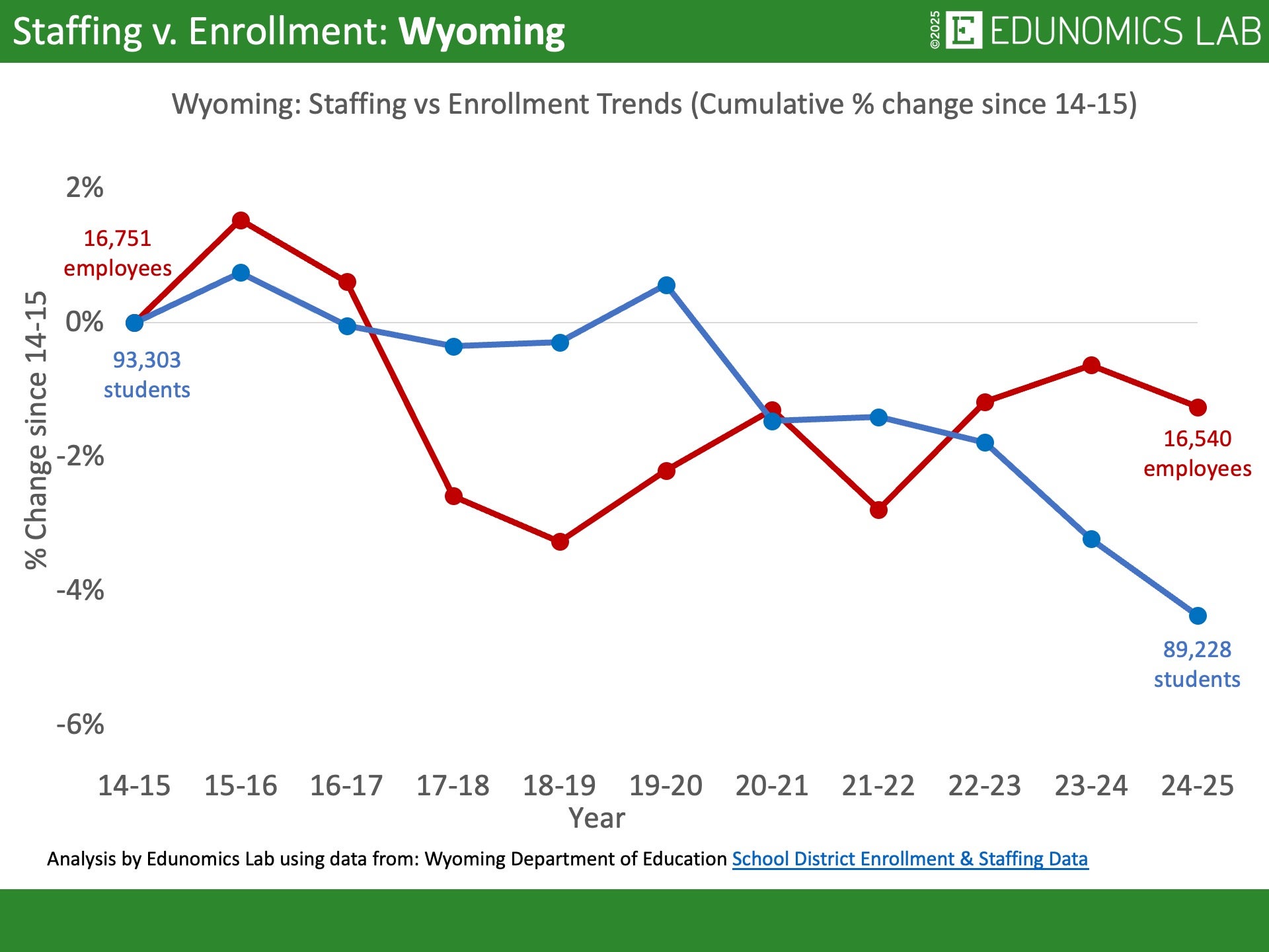
What do the national staffing & enrollment trends look like?
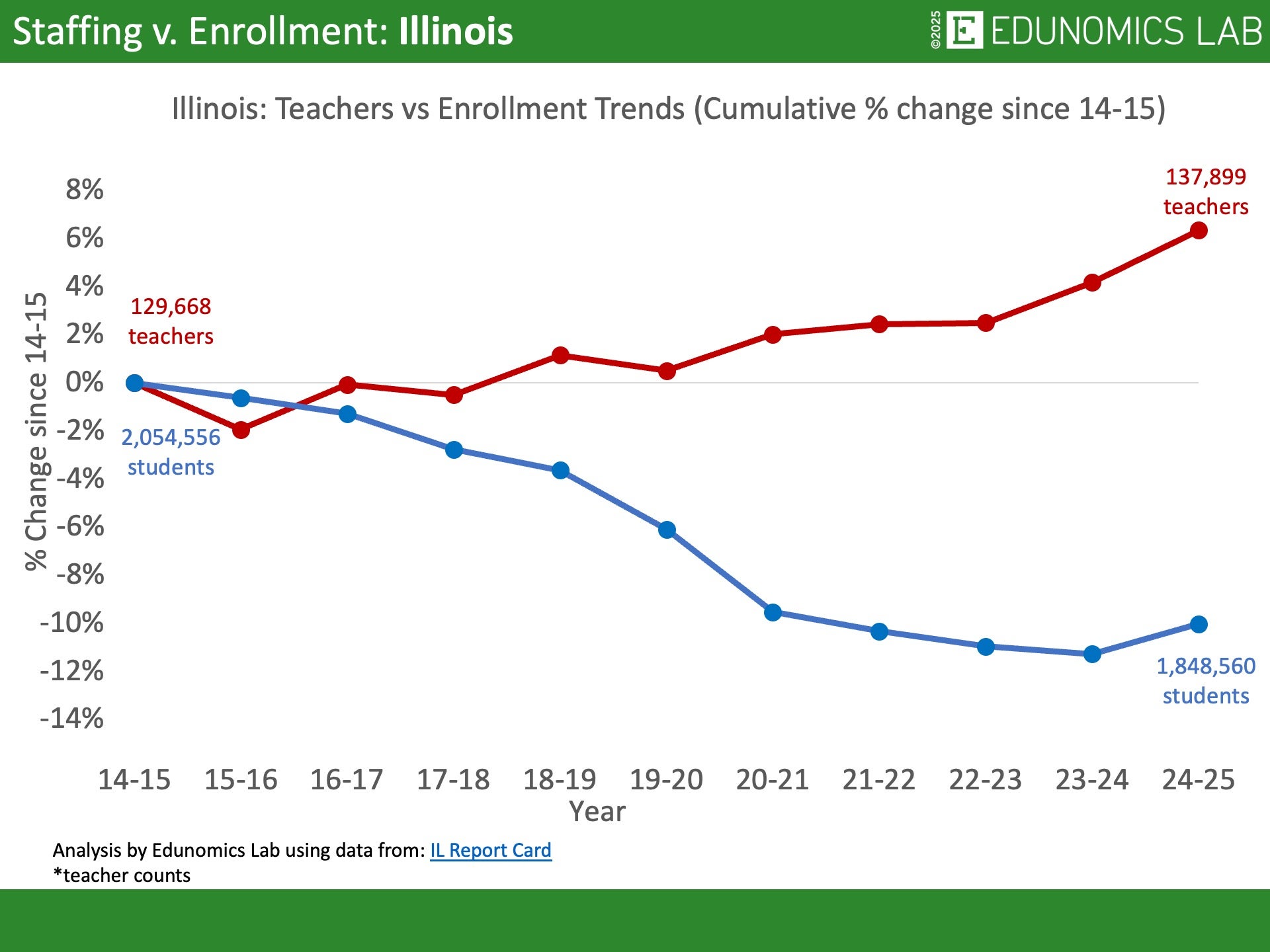
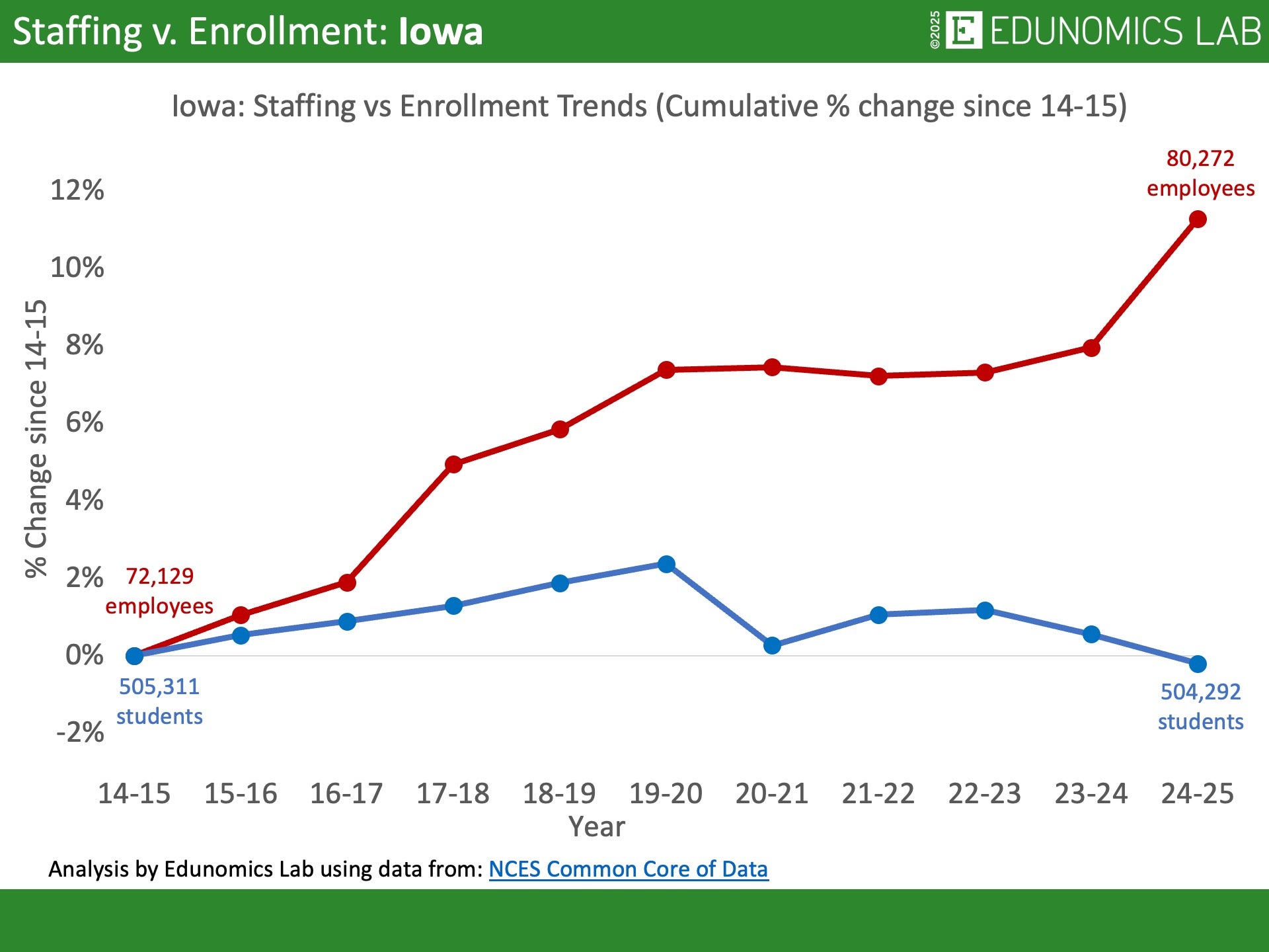
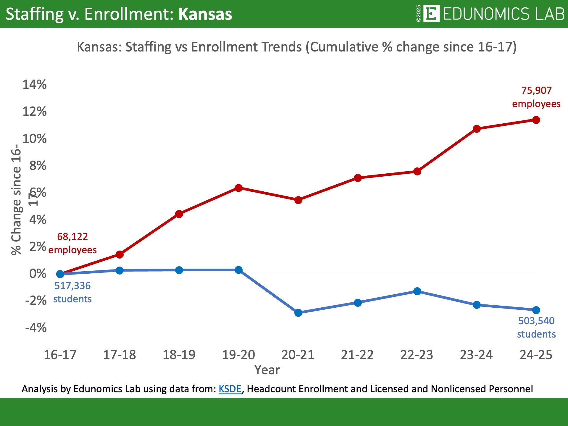
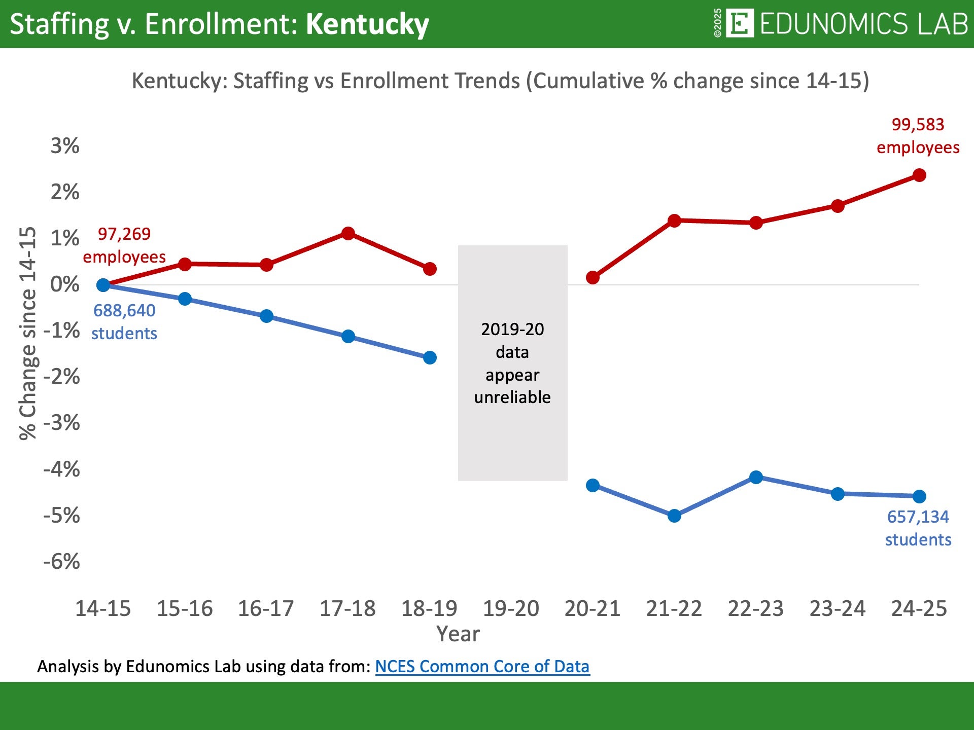
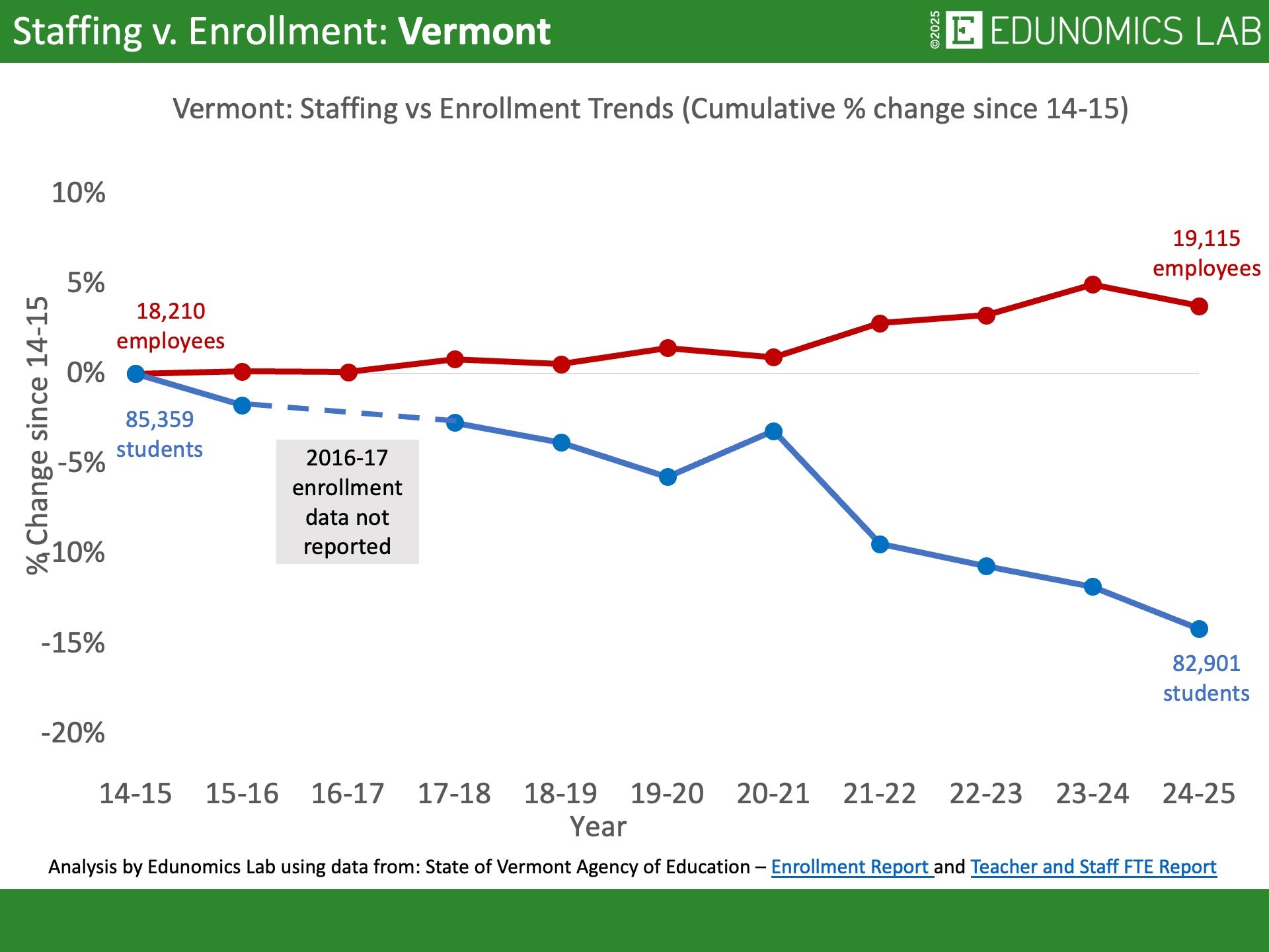
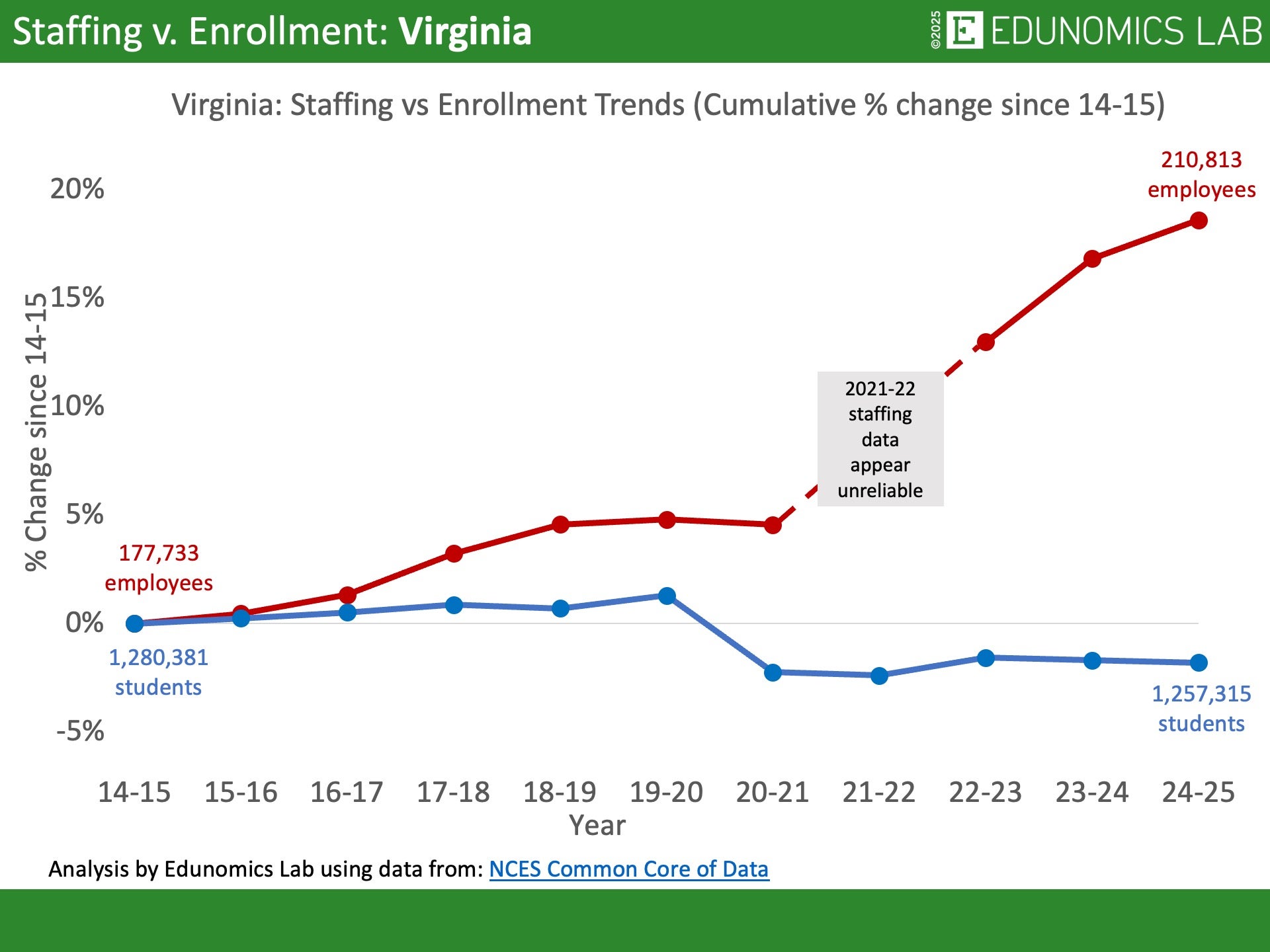
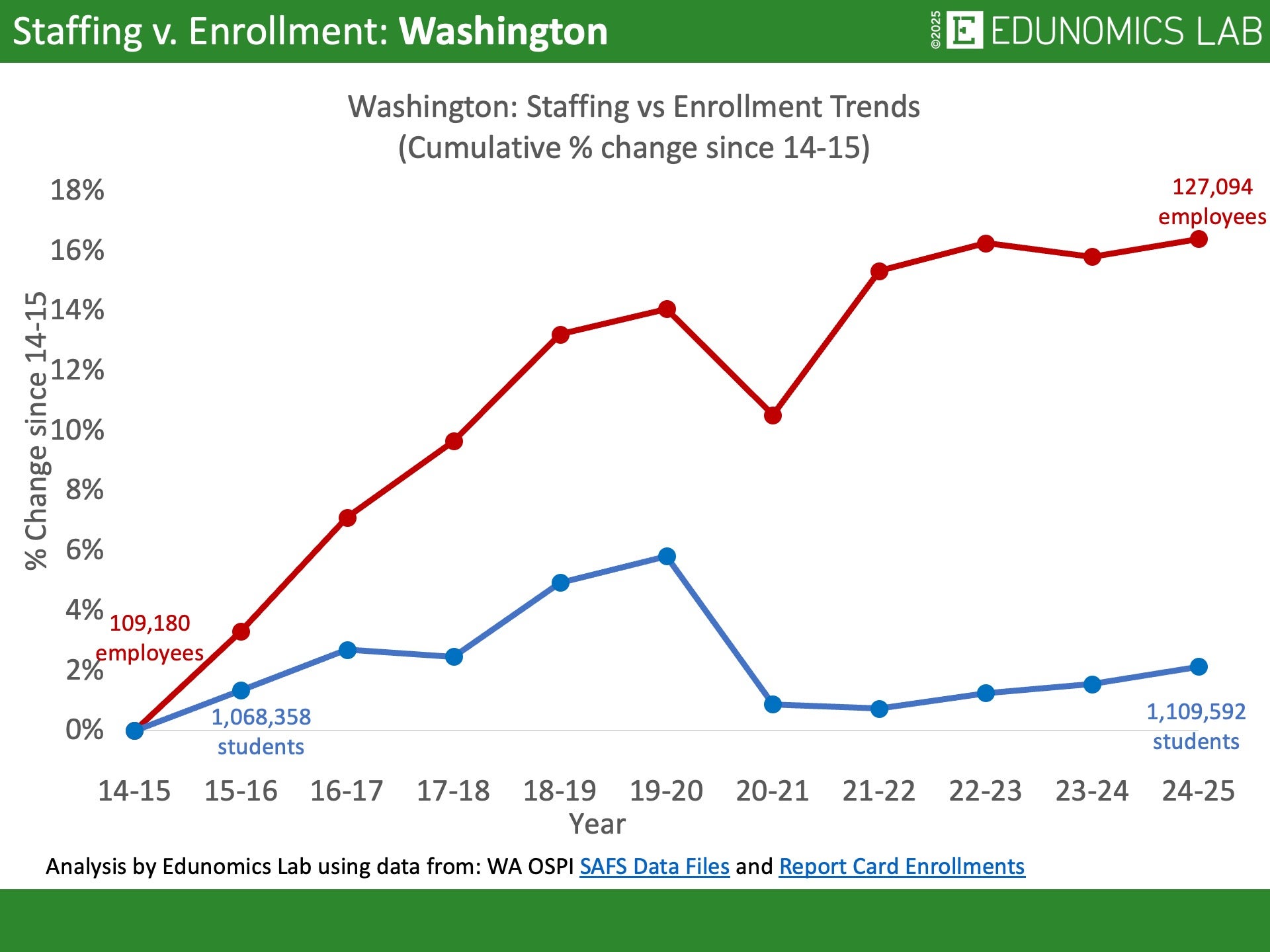
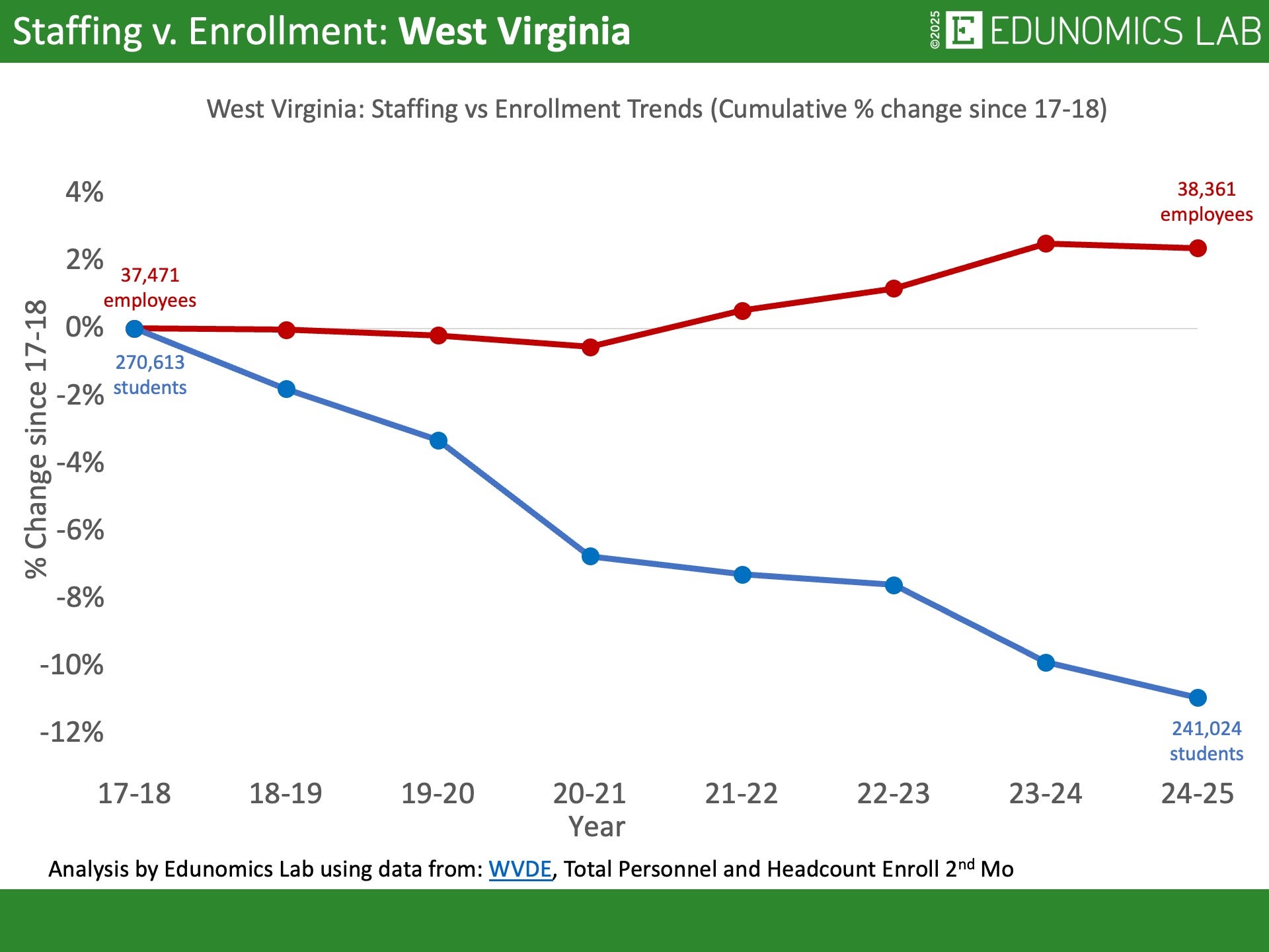
Nationally staffing in K-12 has grown even as overall enrollment has fallen. Explore our charts below to see how the trends compare state-by-state and explore trends for some districts HERE.
We’re regularly adding more, so check back. OR use our template below to make your own.
OR use our template to enter student enrollment and staffing data for your state or district, starting with the 2014-15 school year. We encourage the use of state or district published and audited data. Alternatively, data can be found on NCES Common Core of Data.
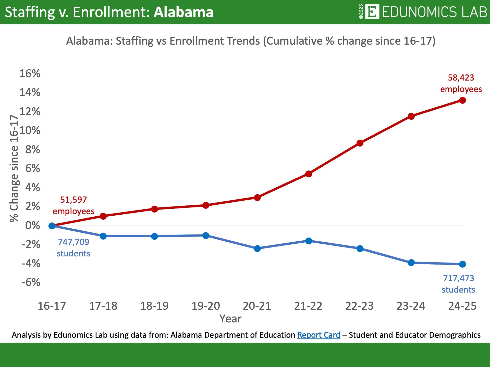
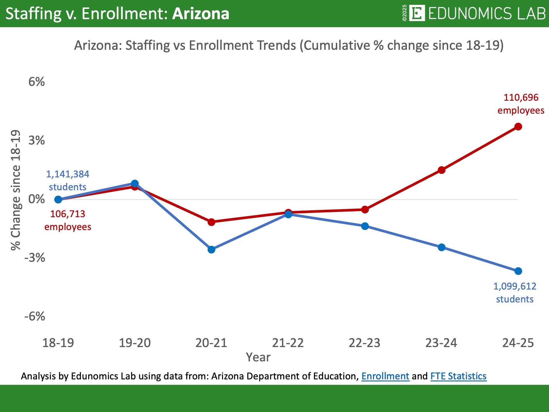
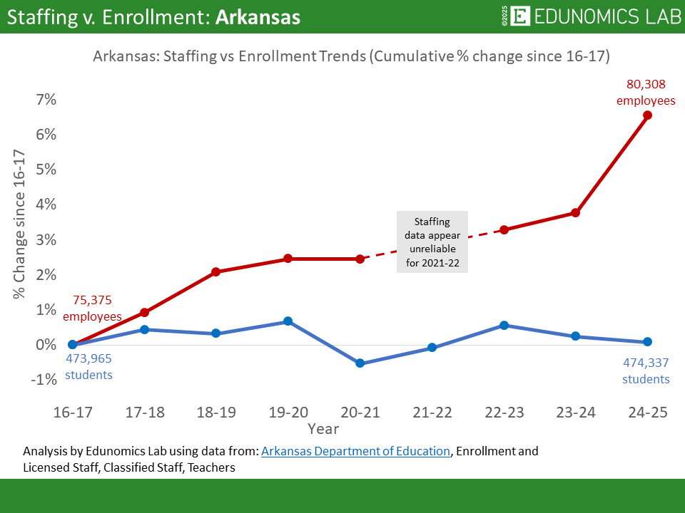
How does the number of staff compare to the number of students in your state or district? How has that changed over time?
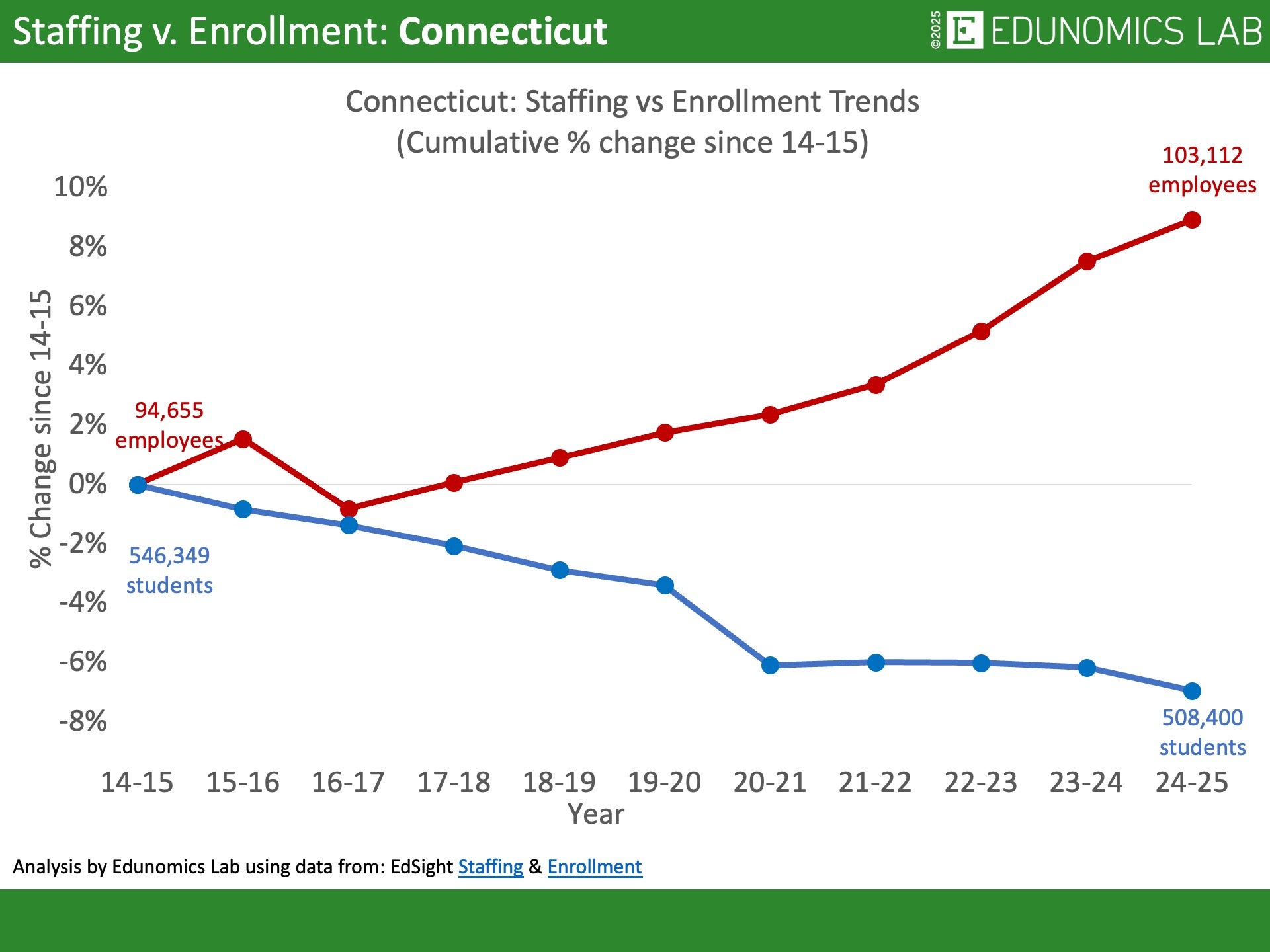
Connecticut
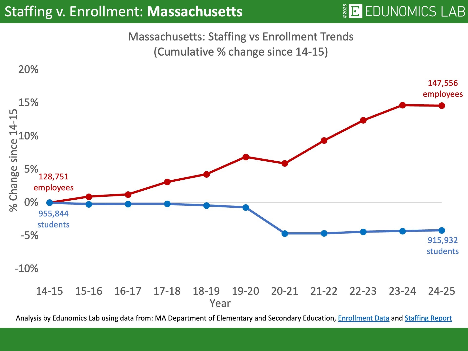
Massachusetts
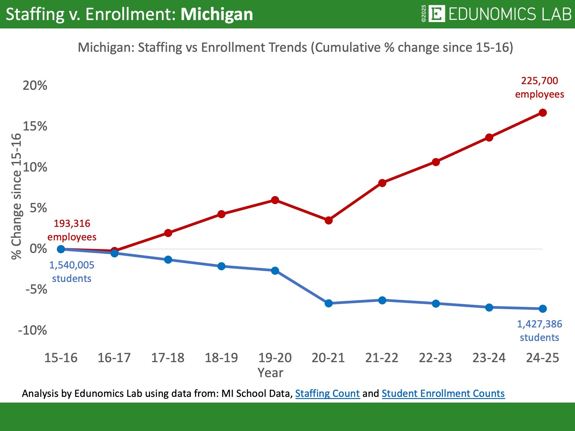
Michigan
Pennsylvania
Texas
Washington
Graph trends for your state or district
STEP 1: Use our template to enter student enrollment and staffing data for your state or district, starting with the 2013-14 school year. We encourage users to use state or district published and audited data. Alternatively, data can be found on NCES Common Core of Data.
STEP 2: Download the custom graph showing staffing versus enrollment trends.